Projects & Case Studies
Real businesses. Real operational build. Not just surface-level design.
These are businesses I’ve worked on at different stages, across different industries. Some needed stabilising. Some needed building properly from scratch. In every case, the real work sat underneath the visuals.
Each project walks through what was happening, what needed fixing or building, what I took on, and what changed afterwards.
If you’re trying to figure out whether I can do what you need, this is probably the most honest place to look.
Jump to a project
Riptide Marine Surveyors
Riptide Marine Surveyors was launched with the technical experience already in place, but without the formal business setup behind it. The name had been chosen, however everything else still needed to be registered, designed and configured before the company could operate properly.
My role was to handle that build-out from the ground up. I managed the CIPC registration process, secured the domain, set up the business email architecture, developed the full brand identity, created the initial company profile, and implemented Xero so that the accounting side of the business was correctly configured from the start.
What began as a straightforward startup setup very quickly expanded into ongoing systems management, bookkeeping, operational support and brand implementation across both digital and physical touchpoints. In many ways, this project shaped how I now approach business setup work, because it required practical decision-making across formation, branding, systems and day-to-day operations, all at once.
Business formation and digital groundwork completed prior to launch.
CIPC Registration
Full company registration management, including account setup and ownership allocation.
Domain Acquisition
Availability review and registration of riptidemarine.co.za to align the digital presence with the registered entity.
Operational Groundwork
Early banking coordination and administrative setup required for trading.
Development and rollout of a complete visual identity system across both digital and physical applications.
Logo Development
Concept exploration, refinement and finalisation of the RMS identity, including multi-format and single-colour variations.
Visual Language
Defined a restrained blue and grey palette aligned with the marine industry and the technical nature of survey work. The tones were selected to reflect credibility, safety and operational reliability, while remaining clean enough to apply consistently across documentation, reports and inspection materials.


Corporate Stationery
Business cards, letterhead and manual document templates created for operational use, including quote, invoice and payslip formats aligned with the brand identity.


Company Profile
A four-page company profile built to clearly present RMS’s services, credentials and inspection scope for client presentations and tender submissions.


Brand Implementation
Applied the identity across practical business touchpoints, including apparel production files, a structured email signature system and a digital inspection stamp for formal survey reports.


Accounting and systems setup implemented to support day-to-day operations and reporting from the start.
Xero Implementation
Initial Xero configuration completed, including organisation setup and core system settings.
Chart of Accounts Build
A structured chart of accounts created to reflect how the business operated and needed to report.
Expense Coding Framework
Categories and coding logic defined to ensure transactions were captured consistently and accurately.
Bank Reconciliations and Bookkeeping Oversight
Monthly reconciliations completed and expense entries maintained to keep the books aligned with the bank statement.
Templates and Document Settings
System templates configured to maintain consistency across financial outputs, even when invoicing was handled internally.
Operational Support and Handover
Ongoing guidance provided to ensure internal admin processes remained structured and repeatable.
Operational documentation and internal support structures developed to keep day-to-day processes consistent.
Manual Document Templates
Custom quote, invoice and payslip templates created for situations where system-generated documents were not used or required..
Digital Inspection Stamp
A branded digital inspection stamp designed for use on official survey reports, ensuring consistency and recognisable documentation output.
Administrative Support
Practical administrative assistance provided during setup and early trading, including document preparation and process guidance where needed.
BiggsFin
BiggsFin started as an idea with industry experience behind it, but nothing formally in place yet. The direction was clear. The capability existed. What didn’t exist was the business structure to support it properly.
I handled the full setup from the ground up. That included CIPC registration, name reservation, beneficial ownership filings, mandate documentation, and making sure the company was compliant from day one. During the brand development process, the positioning evolved from a general consultancy direction into a clearly defined F&I relief placement model. The messaging, visual identity, and documentation were adjusted to support that shift.
The domain was secured, business email infrastructure was set up, Microsoft 365 was structured correctly, and the corporate toolkit was built out. Business cards, email signatures, letterheads, SLA and MSA templates, and a structured company profile were all created so the business could approach dealerships professionally and operate without scrambling to assemble documents later.
The result was not just a logo or a set of templates. It was a fully operational business foundation, ready to trade.
Before launch, the business required four core layers to be built properly:
• Legal formation and regulatory alignment
• Defined positioning and brand direction
• Digital infrastructure for communication
• Structured documentation for dealership engagement
This was not a design-first exercise. The foundation had to be operational, compliant, and credible before the brand could be rolled out publicly.
Business formation and regulatory groundwork completed prior to launch.
BiggsFin required formal registration and compliance alignment before any public rollout could begin. The objective was to ensure the company was legally established, documented correctly, and structured to operate without risk from day one.
Company Registration
• Name reservation lodged and cleared with CIPC• Company registration completed
• Official incorporation documents issued
Regulatory Alignment
• Beneficial Ownership documentation prepared and filed• Mandate and Power of Attorney documentation structured
• Foundational compliance positioning aligned with FAIS, NCA, and related regulatory requirements
This ensured the business was legally established and ready to trade, not just visually branded.
Development and rollout of a complete visual identity system across both digital and physical applications.
Positioning clarified and identity built to reflect the correct market focus.
BiggsFin required more than a logo. It needed a visual system that could sit comfortably inside dealership environments, bank correspondence, and compliance-heavy documentation without feeling decorative or overdesigned.
The direction focused on authority, continuity, and operational credibility.
Logo Strategy
The logo draws on subtle automotive cues, particularly the arched form and segmented detail above the wordmark, referencing movement, dashboards, and performance without becoming literal or gimmicky. This grounds the brand in the dealership environment immediately.
The wordmark itself balances two ideas:
• “BIGGS” carries weight and solidity, reinforcing trust and stability.The tagline “Your F&I Relief Partners” anchors the positioning clearly. This was a deliberate shift away from general consultancy language. The logo now communicates exactly what the business does, without requiring explanation.
The result is a mark that feels automotive, structured, and confident without relying on cliché automotive symbolism.
Colour Psychology
The palette is restrained and intentional.
• Deep graphite and black signal authority, seriousness, and regulatory grounding. In compliance-led industries, darker bases communicate control and professionalism.• Green introduces stability, growth, and forward movement. In a finance context, green subtly signals approval, continuity, and operational flow.
• Soft neutral grey provides balance and legibility, ensuring the brand can function cleanly across documentation.
The choice to avoid bright blues or overly corporate finance tones was deliberate. The green differentiates BiggsFin within the finance space while still feeling grounded and credible.
High contrast background rules, as outlined in the guidelines, protect legibility and ensure the logo always reads clearly in dealership environments where lighting and print quality can vary.

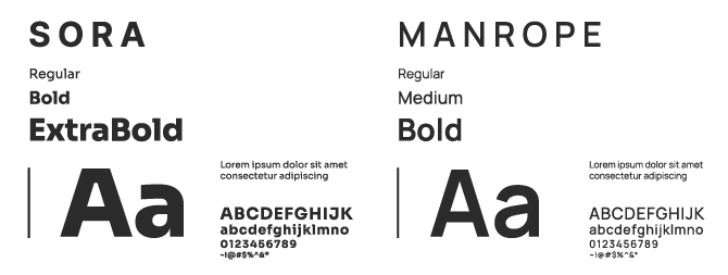
Typography System
The type pairing reinforces structure.
• Sora is used for headings because of its geometric construction and strong presence. It creates hierarchy and confidence in documents such as SLAs, MSAs, and company profiles.
• Manrope is used for body text due to its legibility at smaller sizes and clean neutrality. In long-form documentation, clarity outweighs stylistic expression.
This combination supports:
• Clear hierarchy• Easy scanning in compliance documents
• Professional consistency across print and digital
Nothing in the typography is decorative. Every choice prioritises readability and operational use.
Alignment & Layout Discipline
The layout system follows strict alignment rules and controlled spacing. This was intentional.
In regulated industries, visual disorder creates subconscious distrust. Clean margins, clear space around the logo, and proportional scaling all reinforce credibility.
The clear space rule based on the height of the “B” in BIGGS is not aesthetic preference. It protects recognisability and ensures the brand never feels cramped or improvised.
Consistency across business cards, email signatures, letterheads, and compliance notes reinforces the idea that the business is structured and prepared.

Stationery & Toolkit Integration
The identity was not developed in isolation. It was rolled out immediately across:
• Business cards
• Email signatures with compliance notes
• Letterhead templates
• SLA and MSA templates
This ensured that every touchpoint aligned visually and tonally from day one.
The brand was built to function inside real dealership environments, not just perform visually in isolation.


Corporate Profile Development
The Corporate Profile was developed as a formal dealership-facing document, designed to introduce BiggsFin to dealer principals, groups, and partners. It translates the visual identity and positioning into structured narrative form.
The profile reinforces:
• The relief placement model• The brand promise:
Flexible • Dependable • Professional
• Compliance awareness and regulatory alignment
• Clear service breakdowns
Beyond visual design, the document was structured to guide the reader logically from positioning to services to contact. Typography hierarchy, spacing discipline, and controlled use of brand colour ensure the document feels credible and easy to navigate.
This was not a brochure. It was a strategic introduction tool built for decision-makers.


Structured Digital Infrastructure
Before external engagement began, BiggsFin’s digital environment was formalised to ensure ownership, security, and professional communication.
This included:
• Domain registration and ownership configuration
• DNS setup and hosting alignment
• Business email accounts under the registered domain
• Microsoft 365 subscription setup and structured configuration
The objective was to ensure the business operated under controlled, branded digital assets from day one.
Controlled Communication Environment
Email infrastructure was standardised to prevent fragmented or informal communication during early dealership engagement.
This included:
• Branded email signature rollout
• Structured mailbox configuration within Microsoft 365
• Inclusion of relevant compliance positioning in outbound communication
Every external touchpoint was aligned visually and operationally before the business began trading.
Digital Readiness for Trade
At this stage, the focus was not on layered automation or system expansion. It was on establishing clean, reliable digital foundations.
BiggsFin did not launch with patchwork tools or personal accounts. It launched with controlled infrastructure that supported professional engagement immediately.
Operational Framework & Documentation Development
BiggsFin required structured documentation to operate professionally within dealership environments. This was developed alongside the brand and regulatory groundwork to ensure readiness from first engagement.
The objective was simple: remove friction in dealership conversations and demonstrate operational credibility immediately.
Service-Level & Engagement Documentation
Formal agreement templates were structured to support dealership partnerships, including:
• Service Level Agreement (SLA)
• Master Service Agreement (MSA)
• Mandate documentation
• Structured service breakdowns
Each document was built with compliance awareness in mind, aligning with FAIS, NCA, and dealership operational expectations.
This ensured that every placement was supported by clear terms, defined scope, and professional documentation.
Structured Company Profile
A formal Corporate Profile was developed as a decision-maker document for dealer principals and groups.
It was not designed as a brochure.
It was structured to:
• Clearly explain the relief placement model
• Communicate regulatory awareness
• Outline service scope
• Reinforce the brand promise: Flexible • Dependable • Professional
The document provided BiggsFin with a credible introduction tool when approaching new dealership partners.
Operational Consistency
Beyond individual documents, the toolkit was designed as a cohesive system:
• Letterhead templates
• Compliance-aligned communication structure
• Standardised document formatting
• Controlled typographic hierarchy
This ensured that from first email to formal agreement, the business felt structured, prepared, and reliable.
The outcome was not simply visual branding or registration. It was a fully prepared dealership-facing business, supported by structured documentation and operational clarity.
BiggPrint Designs
BiggPrint Designs started with a lot of energy and very little structure. There was excitement around equipment, suppliers were being contacted, stock was being priced, and ideas were constantly being thrown around. It wasn’t a slow, carefully staged business launch. It was momentum first, organisation second.
What quickly became obvious is that a production business can spiral into chaos if the foundations aren’t built properly. Printing shirts and mugs sounds simple until you factor in inventory tracking, supplier management, cost control, file preparation, accounting logic, compliance, and the reality of people trying to run systems they don’t fully understand yet.
I stepped in to build the underlying framework so the business could function without constantly reacting to its own growth.
That meant handling the full CIPC registration and compliance process so the company was formally established and documented correctly from the start. It meant securing the domain and business email environment so communication was structured and not happening off personal accounts. It meant implementing accounting systems properly, testing them in real scenarios, and then making the call to replace one system with another when it became clear that long-term sustainability mattered more than technical depth.
At the same time, the brand had to work in real life. It needed to print cleanly, embroider properly, translate across supplier documents, invoices, and digital platforms, and still feel like the personality of the business. Nothing could exist in isolation. Every decision affected something else.
BiggPrint Designs was not a light project. It was layered, fast-moving, and emotionally intense at times. But underneath all of that, the objective stayed the same: build something that was legally sound, operationally functional, financially trackable, and visually consistent enough to scale without falling apart.
Business formation and financial structure established before operational scale.
Before equipment purchases and supplier commitments accelerated, BiggPrint Designs needed to be formally structured. I handled the full CIPC registration process and supporting compliance documentation to ensure the company existed correctly on paper from the outset.
• Name reservation lodged and cleared
• Company registration completed
• Incorporation documents issued
• Beneficial ownership documentation prepared and filed
• Mandate and Power of Attorney documentation structured
Financial & Capital Structure
• Startup capital recorded as director loan funding
• Centralised loan tracking sheet maintained
• Setup expenditure logged and categorised from day one
Alongside formal registration, the commercial direction for BiggPrint Designs was clarified. It was positioned as a scalable production business rather than a casual print operation, which influenced supplier selection, margin planning, and systems implementation.
This groundwork ensured that growth would not outpace structure.
Development and rollout of a production-ready visual identity system across digital and physical applications.
BiggPrint Designs needed a brand that felt friendly and approachable, without losing credibility. The early direction was defined as “friendly, approachable, smart-funny,” and that tone shaped every decision that followed.
This wasn’t about making something loud for the sake of it. It was about building an identity that could feel playful on a T-shirt while still looking put-together on a quote or invoice.
Logo Strategy
The final BiggPrint Designs logo leans into personality without sacrificing legibility. The BP monogram anchors the mark with bold, rounded forms, while the diagonal stripe detail introduces movement and energy without making the design feel chaotic.
The layered stripe element was intentionally built to echo print and material processes. It creates a sense of motion and variation while still being clean enough to reproduce across vinyl, embroidery, and digital formats.
The wordmark was kept rounded and approachable to soften the heavier monogram and make the brand feel accessible rather than corporate.
This balance was important. BiggPrint Designs needed to feel creative and fun, but still structured enough to appear on formal documentation and supplier communication.
Colour Psychology
The colour palette is deliberately bold.
Sunshine yellow, coral, and teal sit against slate grey and soft off-white to create contrast that feels energetic but controlled. The brighter tones give the brand personality, while the darker base provides stability when needed.
From a production perspective, the palette was selected to:
• Hold contrast on common garment colours
• Translate cleanly into vinyl and DTF applications
• Remain legible at small sizes
• Work consistently across both digital previews and physical output
The brighter tones also allow for flexibility in product drops and seasonal variation without redesigning the identity.
This is a brand that can show up loudly when needed, but still settle into structured communication when required.

Typography & Everyday Application
Typography plays a key role in reinforcing the tone.
Nunito ExtraBold was used for headline applications and forms the basis of the logo styling. Its rounded construction supports the approachable voice of the brand while still carrying visual weight.
Open Sans functions as the secondary typeface, chosen for readability and neutrality across longer-form content, quotes, invoices, and supplier communication.
This pairing creates a clear hierarchy without introducing unnecessary complexity.

Operational Rollout
The identity was rolled out immediately across:
• Business cards
• Letterhead templates
• Email signatures
• Quote and invoice templates
• Platform-ready logo deployment
This ensured BiggPrint Designs looked consistent across both physical products and formal documentation from the outset.
The brand was designed to live inside the business, not just represent it externally.
Digital infrastructure became critical once the business began operating at pace.
Domain & Infrastructure
Domain and hosting were secured and structured correctly from the outset, ensuring that email and future digital assets were properly anchored.
Business Email Environment
Company email accounts were configured and rolled out early to prevent informal communication from becoming operational habit.
Accounting Architecture
The business first underwent a full Zoho Books and Zoho Inventory backend implementation. This included:
• Inventory structuring• Item grouping
• Supplier bill workflows
• VAT handling logic
• Director loan recording
• Costing behaviour
• Internal stock adjustments
• Process documentation manual
• A complete internal manual was written to guide usage.
After testing the workflow, a strategic decision was made to move away from Zoho. The system was technically robust but too complex for sustainable handover without ongoing dependency.
The business was migrated to a full Xero implementation instead.
The Xero setup included:
• Tracking categories
• Inventory item setup
• COGS logic
• Bank feed integration
• Invoice templates
• Financial reporting structure
In parallel, feasibility and integration planning was done to bridge Xero and Shopify for future e-commerce capability. No implementation occurred, but the pathway was mapped.
This phase was about building a system the business could realistically run without being reliant on me.
Systems, documentation, and workflow structure built to support day-to-day production.
My focus within BiggPrint Designs sat in building the systems and documentation that supported day-to-day production.
Accounting & Cost Control Framework
A full backend structure was implemented to ensure that inventory, cost of goods, supplier bills, and director funding were recorded correctly from the outset.
This included:
• Inventory item structuring
• Cost tracking logic
• Director loan recording
• Supplier bill workflows
• Margin visibility
• Preparation for e-commerce integration
The objective was to prevent financial confusion once production volumes increased.
System Documentation & Knowledge Transfer
During the initial Zoho implementation phase, I created a structured internal manual outlining how to:
• Record inventory purchases
• Manage grouped items
• Handle internal-use stock
• Maintain VAT accuracy
• Avoid common data-entry errors
Although Zoho was later replaced with Xero, the documentation reflects the process discipline applied during setup.
System Simplification & Sustainability
After testing the Zoho environment in real use, I made the decision to migrate the business to Xero. The shift prioritised sustainability and ease of handover over system complexity.
The intention was to build something the business could realistically manage without ongoing reliance on me.
This was not a software preference decision. It was a sustainability decision.
Workflow & Accountability Structure
To support day-to-day operations, shared task management and document systems were implemented. Roles were clarified to reduce duplication and operational drift, and accountability tools were introduced to ensure production activity translated into measurable progress.
Sample Testing & Production Graphics
During early product sampling phases, I supplied and designed graphics used for T-shirt and apparel test prints. Files were prepared to production-ready standards, supporting clean output across DTF and vinyl processes.
This ensured that early product testing reflected the brand accurately and reduced avoidable print errors.
Barrelhaus
Barrelhaus began as a product-led idea, but from the outset it was clear that the business around it needed to be taken seriously. While the manufacturing and sourcing were handled separately, my involvement focused on setting up the operational side so that the company could function properly from the beginning.
That meant registering the company, filing for design protection, securing the domain and business email environment, building out the identity system, and structuring the accounting setup in a way that reflected inventory and production realities. It also meant preparing employment contracts and internal documentation before hiring took place, so that growth would not rely on informal arrangements.
The work centred on building the structure underneath the product rather than the product itself. Barrelhaus needed to look established and operate cleanly, and that required legal alignment, financial logic, and consistent communication across every formal touchpoint.
My role was to build that framework so that the business side of Barrelhaus was stable, protected, and able to support whatever direction the product took.
Business formation and design protection completed before operational rollout.
Barrelhaus required formal structuring before any growth activity.
• Private company registration completed
• Foundational compliance documentation aligned
• Company structured for formal trading from inception
• First product design formally filed
• Design protection confirmation received and recorded
• Early-stage risk mitigation implemented before market exposure
• Domain secured and anchored to the business entity
• Business email environment established
• Personal channels avoided for supplier and compliance communication
This ensured that Barrelhaus existed correctly on paper, was protected at product level and able to operate through formal business channels from the outset.
Development and rollout of a production-ready visual identity system across digital and physical applications.
Barrelhaus required an identity that felt established from inception. The product category sat in an industrial space, so the visual language needed weight, structure, and longevity rather than trend-driven styling.
The direction leaned into a vintage forge aesthetic, combining strong framing devices, bold serif typography, and a restrained industrial palette. The result was an identity that felt grounded and deliberate, without becoming decorative.
Logo Strategy
The primary mark was developed as a badge-style logo incorporating the barrel form directly into the identity. This created immediate association while remaining versatile across print and digital use.
The system included:
• Primary circular badge with barrel illustration
• Banner-style horizontal lockup for wide-format applications
• Side-profile barrel variation for product use (including coaster applications)
• Distressed print-ready variation for textured and heritage applications
The badge structure reinforces permanence, while the strong typographic treatment ensures legibility across engraving, print, and signage.
The tagline Forged by Legends, For Legends was integrated to support positioning without overpowering the core mark.
Colour Psychology
The palette was intentionally restrained and industrial.
• Warm leather brown
• Deep charcoal / steel grey
• Soft off-white
• Supporting neutral tones
The brown introduces warmth and craft heritage. The charcoal anchors the system in strength and durability. The off-white softens contrast and supports readability across documentation and print.
The combination allows the brand to sit comfortably across corporate documentation, hospitality environments, and branded product applications without requiring seasonal variation.

Typography & Everyday Application
The BARRELHAUS wordmark was not built from a standard installed font. A vintage-style vector alphabet lettering set was used to construct the name manually, allowing full control over spacing, weight, and distress treatment within the logo system.
This ensured consistency across all logo variations and allowed the distressed finish to be applied deliberately rather than relying on a pre-built typeface.
For headings and highlight text within documentation, Sheepman was used as a typable display font. Its structured, heritage tone aligned with the brand direction while remaining practical for editable content such as document headings and signature blocks.
No formal body text system was established at this stage. Typography within documentation remained functional and secondary to the core identity marks.
The approach prioritised control over the logo form while keeping supporting content clean and workable.

Operational Rollout
The identity was fully implemented across formal and operational touchpoints, including:
• Email signature
• Business letterhead template
• Quote and invoice templates
• Corporate registration header
• Banner layouts
• Company profile design
This ensured that Barrelhaus presented consistently across internal documentation, supplier communication, and external-facing material from the outset.
The brand was not developed in isolation. It was deployed directly into the working structure of the business.


Digital infrastructure for Barrelhaus was structured from the outset to support financial control, production visibility, and clean internal record keeping.
There was no migration phase. The system was built intentionally in Xero from day one.
Domain & Email Environment
• Domain secured and structured
• Business email accounts configured
• Email signatures rolled out in line with brand identity
• Formal communication channels established early
The objective was to ensure operational communication did not default to informal messaging once activity increased.
Full Xero System Architecture
Barrelhaus was set up with a complete Xero backend configuration before operational activity gained pace.
This included:
• Full chart of accounts configuration
• Tracking categories structured for production visibility
• Inventory item setup
• Cost of goods logic configuration
• VAT handling structure
• Director loan and funding logic
• Expense categorisation and capture
• Invoice and quote templates aligned to reporting structure
Although the bank feed was not connected at the time due to the absence of a business bank account, all expenses were captured manually to maintain financial accuracy from the outset.
The Xero Expenses module was implemented to allow fuel and operational expense capture directly by employees, reducing informal reimbursement tracking.
Production & Inventory Flow Guide
A structured internal guide was created to document how production-related activity should move through the accounting system.
This covered:
• Inventory input recording
• Production-related cost allocation
• Internal use stock handling
• Expense capture logic
• Reporting checkpoints
The intention was to remove ambiguity around how operational activity translated into financial data.
System Sustainability
The system was built with long-term independence in mind.
• Clear categorisation structure
• Reduced unnecessary complexity
• Documented workflows
• Designed for internal usability without ongoing reliance
The goal was to ensure Barrelhaus could operate with financial visibility and accountability embedded into its daily processes.
Operational structure was formalised early to ensure compliance, role clarity, and internal accountability as the business prepared to employ staff.
Corporate Documentation Suite
A complete employment and governance documentation framework was developed to support formal hiring and internal policy control.
This included:
• Offer of employment template
• Employment contract template
• Annexure with defined job description and responsibilities
• Confidentiality and consent documentation
• New employee information form
• Employee vehicle information form
The objective was to ensure that hiring did not occur informally and that expectations, compliance, and record-keeping were clearly documented.
Internal Policy Framework
A structured internal policy pack was created to define operational boundaries and usage standards.
This included:
• IT & device use policy
• Confidentiality & non-disclosure policy
• Leave policy
• Vehicle & fuel policy
• Expense & reimbursement policy
The policies were designed to protect the business operationally while creating clarity around conduct, asset use, and financial accountability.
Financial & Expense Control Structure
Operational processes were aligned with the Xero system to ensure activity translated accurately into financial records.
• Expense submission structure defined
• Fuel and operational cost capture formalised
• Reimbursement workflow clarified
• Documentation aligned with accounting categories
This reduced reliance on informal expense tracking and verbal agreements.
Template & Administrative Rollout
To support consistent documentation across the business, the following were designed and implemented:
• Branded letterhead template
• Quote template
• Invoice template
• Email signature standardisation
The intention was to ensure all outward-facing documentation aligned with internal record structures and brand identity.